

When the call came to create some hand-painted botanical artwork as part of this modern eatery and bar’s rebrand, we jumped at the chance to get the paints out!
Read on to find out what we created for the new-look Firenze restaurant in Nantwich.
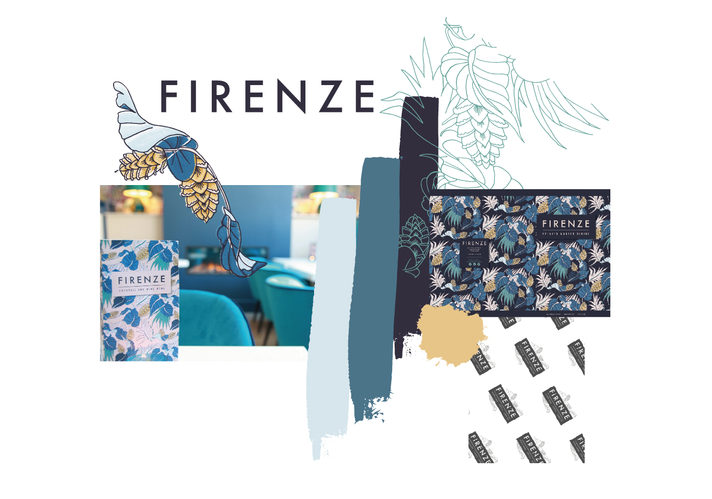
Deep blues and muted pastels
When Louise approached TLPS to create a new-look brand for Firenze – set to launch alongside the revamped interior, after working with Cara previously on the murals featured in another of her restaurant and hotels, The Cheshire Cat – we didn’t hesitate to take on this dream brief!
Inspired by the beautifully maximalist wallpaper that was to be a feature of the new-look restaurant and bar, Louise tasked Cara with recreating the ornate botanical design in a hand-painted style for a dramatic effect throughout the marketing collateral and menu designs. Painstakingly drawn out and painted by hand, Cara recreated the pattern before digitising for easy use when designing for the brand going forward.
The creation of a digital pattern tile whilst still keeping the original hand-painted textures, allowed Cara and the team to utilise elements of the botanical drawings across all the designs – creating a truly unique and illustrative brand, very much in keeping with the new and elegant look for Firenze!
I kept to the original colour palette of deep blues, bright turquoises, muted pastels and mustard yellows, but the creation of a digital pattern allowed Louise and I to flip the colour palette away from the main menu to a pink background for the cocktail menus – allowing easy differentiation between the two for customers and staff alike!
Cara Green, Creative Director at The Little Paper Shop
Brand Design
// colour palette // fonts // brand pattern // design elements // social media asset creation // full brand guidelines // recreation of in-house wallpaper as a hand-painted and digitised pattern tile // main dining menu // cocktail and drinks menu // children’s menu // luxury finish design and print // brand pattern interior signage design // gift vouchers // promotional leaflets // business stationery // branded staff uniform // food packaging // design and print //
Take a look at what we’ve done!
Here’s just a selection of the commercial design and photography work we’ve created
Want to talk to us about your business’s branding and marketing needs?
We’d love to help!


